C090 CSS Framework - Tailwind
In this task, you will use Tailwind CSS to style the following HTML:
<!DOCTYPE html>
<html lang="en">
  <head>
    <meta charset="UTF-8" />
    <meta name="viewport" content="width=device-width, initial-scale=1.0" />
    <title>Document</title>
  </head>
  <body>
    <div>
      <h1>Demo of Tailwind</h1>
      <div>
        <p>Lorem ipsum dolor sit amet consectetur adipisicing elit. Corporis velit itaque, unde quaerat blanditiis quo odio enim repellendus repellat eos, tempore explicabo architecto obcaecati beatae cumque alias qui perspiciatis! Eum.</p>
      </div>
      <div>
        <button>Primary Button</button>
      </div>
      <div>
        <div>
          <div>
            Notification
          </div>
          <p>Lorem ipsum dolor sit amet consectetur adipisicing elit. Quibusdam possimus quia fuga ipsam numquam doloribus molestiae. Debitis ut eligendi facere? Temporibus, reprehenderit eum quasi qui recusandae similique magni voluptatibus ullam.</p>
        </div>
      </div>
      <div>
        <table>
          <thead>
            <tr>
              <th>Id</th>
              <th>Name</th>
            </tr>
          </thead>
          <tr>
            <tr>
              <td>1</td>
              <td>Mathias</td>
            </tr>
            <tr>
              <td>2</td>
              <td>Mikkel</td>
            </tr>
          </tr>
        </table>
      </div>
    </div>
  </body>
</html>
You need to modify the HTML using Tailwind CSS to achieve the following result:
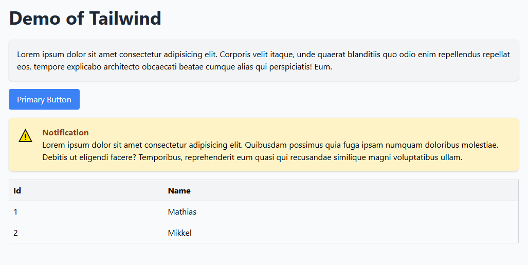
Add the Tailwind CDN
Link Tailwind CSS directly from a CDN:
<link href="https://cdn.jsdelivr.net/npm/tailwindcss@2.2.19/dist/tailwind.min.css" rel="stylesheet">
Tasks
- Add Padding and Centering:
- Wrap everything in a
divwithclass="container mx-auto p-4". -
Center content using
flexandjustify-center. -
Style the Header:
-
Use Tailwind classes to style the
h1with a large font size and bold text (text-4xl font-bold text-gray-800). -
Style the Paragraph:
-
Wrap the paragraph in a
divwithclass="p-4 bg-gray-100 rounded-lg shadow". -
Style the Button:
-
Add Tailwind classes to make the button stand out (
bg-blue-500 text-white py-2 px-4 rounded hover:bg-blue-700). -
Style the Notification Box:
- Use a
divwithclass="flex items-start space-x-4 bg-yellow-100 p-4 rounded-lg shadow"for the notification. -
Add an
iconusing a simple placeholder (<span class="text-yellow-500 text-2xl">⚠️</span>). -
Style the Table:
- Use Tailwind’s table utilities to style the table with padding, borders, and alternating row colors:
- Add
class="table-auto border-collapse border border-gray-300 w-full text-left". - Add
class="border-b border-gray-300 bg-gray-100"to thetheadrows. - Add
class="p-2 border-b"to table cells.
- Add
Solution Example
<!DOCTYPE html>
<html lang="en">
  <head>
    <meta charset="UTF-8" />
    <meta name="viewport" content="width=device-width, initial-scale=1.0" />
    <title>Document</title>
    <link href="https://cdn.jsdelivr.net/npm/tailwindcss@2.2.19/dist/tailwind.min.css" rel="stylesheet" />
  </head>
  <body class="bg-gray-50">
    <div class="container mx-auto p-4">
      <h1 class="text-4xl font-bold text-gray-800 mb-6">Demo of Tailwind</h1>
      <div class="p-4 bg-gray-100 rounded-lg shadow mb-4">
        <p>Lorem ipsum dolor sit amet consectetur adipisicing elit. Corporis velit itaque, unde quaerat blanditiis quo odio enim repellendus repellat eos, tempore explicabo architecto obcaecati beatae cumque alias qui perspiciatis! Eum.</p>
      </div>
      <div class="mb-4">
        <button class="bg-blue-500 text-white py-2 px-4 rounded hover:bg-blue-700">Primary Button</button>
      </div>
      <div class="flex items-start space-x-4 bg-yellow-100 p-4 rounded-lg shadow mb-4">
        <span class="text-yellow-500 text-2xl">⚠️</span>
        <div>
          <h2 class="font-bold text-yellow-800">Notification</h2>
          <p>Lorem ipsum dolor sit amet consectetur adipisicing elit. Quibusdam possimus quia fuga ipsam numquam doloribus molestiae. Debitis ut eligendi facere? Temporibus, reprehenderit eum quasi qui recusandae similique magni voluptatibus ullam.</p>
        </div>
      </div>
      <div>
        <table class="table-auto border-collapse border border-gray-300 w-full text-left">
          <thead>
            <tr class="border-b border-gray-300 bg-gray-100">
              <th class="p-2">Id</th>
              <th class="p-2">Name</th>
            </tr>
          </thead>
          <tbody>
            <tr class="border-b">
              <td class="p-2">1</td>
              <td class="p-2">Mathias</td>
            </tr>
            <tr class="border-b">
              <td class="p-2">2</td>
              <td class="p-2">Mikkel</td>
            </tr>
          </tbody>
        </table>
      </div>
    </div>
  </body>
</html>
This example demonstrates the power of Tailwind’s utility-first approach to building clean and responsive designs. Let me know if you need further assistance!